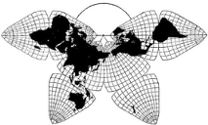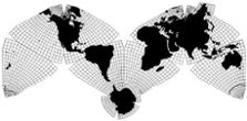
Cahill 1909

Cahill-Keyes 1975

Cahill 1909
|
Go back to
Gene Keyes home page
Cahill-Keyes 1975 |
|
Why Cahill? What about Buckminster Fuller?
Evolution of the Dymaxion Map: An Illustrated Tour and Critique Part 9.1 by Gene Keyes 2009-06-15 Summary: I
love Bucky, but Cahill's map is a lot better.
Here's how.
CONTENTS Click inside boxes to open other sections in separate windows. 9) Critique: Seven Design Flaws of Fuller's Map as Compared to Cahill's |
|
9) Critique
Seven Severe Design Flaws of Fuller's Map as Compared to Cahill's Before looking at all the minuses of the Fuller map, let me credit seven plusses: 1) Its unbroken continents;But here is my assessment of its seven deadly design shortcomings, none of which afflict the Cahill map: 1) Asymmetry of layout; Add to that the frequent misstatements by Fuller
et al that the Dymaxion Map was the first to show
the continents undistorted and unbroken; was the first
to get a patent; etc., when Cahill had already done all
three, over thirty years earlier. (And without distorting East
Asia and Norway, as does Fuller.)
|
Fig. 9.1.1:
Cahill octahedral, 1909
|
| Fig. 9.1.2: Fuller icosahedral, 1954 
|
|
Remarks: The Fuller design is grossly
asymmetrical, especially compared to Cahill's total symmetry.
(And that is without regard to Fuller's completely
irregular graticule, discussed in Part 9.2. Not only is the exterior
framework asymmetrical, but so is the interior grid of every single
triangle.) As well, we have those four sore-thumb pieces at Antarctica
and Oceania, from two triangles, each with a different split,
resulting in 22 pieces rather than 20. Even without such a split
(which I don't think was needed; see Part 6, Fig. 6.5), the
Dymaxion icosahedron lacks a symmetrical layout, such as a sub-logo
of the Buckminster Fuller Institute:
Fig. 9.1.3 Source: http://challenge.bfi.org/ideaindex
Fig. 9.1.4: Nor, of course, does the Dymaxion
icosahedral accord with the symmetrical diagram which accompanied
its original 1954 publication:

Source: (See Part 5.) Scanned by Gene Keyes from
R. Buckminster Fuller, "Dymaxion Airocean World Fuller Projective Transformation" [Raleigh, North Carolina, 1954; l large folded sheet, 13x19", 33x49 cm, to accompany the Raleigh Edition of the Dymaxion Map.] (Diagram also seen at p. 702, Fuller, Synergetics, [vol. 1]) Barring the octahedral's incisions, Cahill has
10 main outer edges. Fuller has 26. I will elaborate in
Part 9.7 about how the complex asymmetry of the Dymaxion icosahedral
makes it far more difficult to "learn a globe" than a pairing
of Cahill and a globe. Suffice to say here that a simple
glance at the outline of the Fuller and the Cahill adjacently
makes it evident that Cahill has the elegant design.
Next, consider the continental profiles of those two maps. They are essentially similar (though regarding Fuller's "imperceptible" distortion, one might see his South America and Australia are a bit shrunken). Fuller avers that his map shows continuity across the Arctic area; I argue (in more detail below) that the result is an unacceptable distortion of Korea and vicinity. Meanwhile, notice in the two maps above, how the act of "pulling" Eurasia closer to Greenland in the Dymaxion causes its rupture of East Asia, tearing Korea 60º from the mainland. Admittedly, this 1920 version of Cahill does not show Antarctica, but that is easily remedied by attaching the icy continent to the apex of any of the octants, as I have done in the Cahill-Keyes revision (see top of this page, and also here). Reuniting Antarctica is also more possible with Cahill's 1936 "C" model shown in Part 9.2 next, because it has right-angle vertices, instead of curved. Furthermore, various alternate tile arrangements in a Cahill map, e,g, Butterfly profiles joined at Atlantic or Pacific, and ditto for "M" profiles; etc., not only retain octahedral symmetry, but unbroken continents as well. A Cahill map thereby has more flexibility and versatility than Fuller's. Alternate tile arrangements in a Fuller map not only aggravate its asymmetry, but break the continents. Not that I am obsessed about
symmetry, though I certainly prefer it. (I will say that Cahill himself
went too far with symmetry when he decided to incise his map by 22 1/2º,
and to divide the globe at 22 1/2º W, instead of the far
preferable 20º W.)
However, my essential argument, further on, is how the simple symmetry of the Cahill design facilitates balanced comprehension of the globe. Fuller's raggedy layout does not. His icosahedron further disorients the user because of its non-alignment to the global axis, its non-alignment to any parallel or meridian, and hence its non-alignment to a globe. |
|
Which brings us to the second fatal
flaw of the Dymaxion map: its deplorable graticule.
Go to Part 9.2Total Irregularity of Graticule |