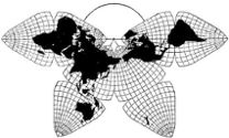
Cahill 1909
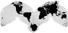
Cahill-Keyes 1975

Cahill 1909
|
Go back to Gene Keyes
home page
Cahill-Keyes 1975 |
Update 2012-01-15: Steve Waterman has just released a new improved version of his map, superseding the one discussed below. It makes some of the criticisms here obsolete, as well as many of my illustrations, and it now incorporates satellite imagery provided by Joe Roubal. But I will leave this review here as is, until I get around to nitpicking Waterman's new one. |
|
Review of the Waterman World Map
Gene Keyes 2010-09-24 
Source: postcard version of Waterman map, distributed by ODT; scanned by GK. © 1996, 2007 by Steve Waterman. |
|
Prologue: In
1996, Steve Waterman produced a 69 x 96 cm octahedral world map, resembling B.J.S. Cahill's
almost forgotten 1909 Butterfly World Map. 1996 was also the year I acquired
my first Mac, and went on the Internet, collecting maps among other things; but I did not stumble across the
Waterman map until April 2006, at ODT, the map's distributor; via Carlos Furuti's website. How had I missed that one?
According to the Wayback Machine, it was early 2006 that Waterman's map appeared on the Net: at websites of ODT, and Carlos Furuti; and Waterman himself. So I was not as far out of the loop as I had feared. (Latter three links above are their old 2006 versions, from Wayback, which lags at recording pages; Bob Abramms of ODT tells me that summer 2005 was when ODT gave the map its first exposure on the Web, apart from an abortive earlier version of Waterman's site.) The Waterman map was quite a surprise to me, because between 1975 and 1984 I had been researching Cahill's works and archives, and doing my own re-design of his octahedral projection. But mine did not get beyond black-and-white outline prototypes, aiming at a scale of a 1/1,000,000 Megamap. Due to personal exigencies, this effort languished for nearly two decades. After retirement in 2003, I began refreshing my Cahill paper files and downloads; and in 2006, voilà, Waterman! A full-color Cahill-esque wall map, with boundaries, labels, and geophysical pigmentation! (Unlike Cahill's old b&w's.) I bought several copies of the map from ODT, began exchanging e-mails with Waterman, and started the Wikipedia page about his projection, as well as my earlier one on Cahill himself. (Besides my own ongoing Cahill Resource as part of this website.) |
| Fig 1: This is (or was) the largest available online image of the full 1996 version: |
For full-size (2 x) image, click in it once. To restore half-size, click in it twice.
|
|
For some time I've been intending do a critical scrutiny of the Waterman
map, which differs in significant detail from mine. By way of disclosure,
let me say that while I admire the Waterman, I prefer the Cahill-Keyes.
;-) This review is not intended to disparage Waterman. Rather, it simply explicates
our varying approaches — which were quite independent of each other — to
a similar octahedral framework after Cahill. The compare-and-contrast commentary
is divided into macro and micro considerations: the overall design (macro); and the octants' internal skeleton details (micro).
To summarize my observations: On the plus side, Waterman's is a major accomplishment in the realm of the octahedral Butterfly Map. B.J.S. Cahill never published a wall-size, nor a color, version of his Butterfly (though he did prepare a very large hand-colored prototype, ca. 1912.).
On the minus side, all the map's big flaws occur in the polar areas:
|
Macro considerations (overall design)1) Origins To begin with, our starting points were completely different. Steve Waterman is a nuclear physicist and mathematician, interested in polyhedra and close-packing of spheres; while I am a former world politics prof seeking a more accurate canvas to display international affairs, etc.. His map derives from a mathematical conception of those close-packed spheres, while mine begins with geopolitical design precepts, e.g., to have a single world map at small to giant scales, and adapting Cahill to show proportional geocells across the entire map. His map is more attentive to precision of "equal area", while mine is focused on the principle of overall "global fidelity". Unlike Cahill, we both converged at the meridian of 20º West as the key dividing line; but in most other particulars our details and designs are quite disparate. 2) Butterfly or "M"? Our most visible variance is Waterman's use of Cahill's "Butterfly" pattern, with Pacific Ocean "wings" at left and right, whereas my design links Old and New worlds at the South Atlantic in an "M-shape" profile. As explained elsewhere, until switching to Cahill, I was engrossed in Buckminster Fuller's Dymaxion map, and had dismissed Cahill's Butterfly at first glance, because I wanted all my place names more or less horizontal — for a single all-purpose map at any scale from smallest to largest. This the "M" accomplished; one does not have to read Australia or Algeria sideways, as with a Buitterfly, or Dymaxion. (Of course, Earth has no "right side up, North-top"; merely ingrained habit.) I think the Atlantic, and especially the Pacific, Butterflies can be useful as alternate and subsidiary profiles; but "M" is best as a general purpose view at all sizes. 3) Overhang Re-attachments A key macro design detail, which I include, but Waterman doesn't, is completion of Eurasia, by joining Russia's Kamchatka peninsula with a repeat cutout of the area near Alaska; likewise for the far northeastern coast of Greenland; and likewise for Melville Island of the Canadian Arctic, just above Victoria Island. (Also, in my case, with the M-profile, Iceland must be re-united that way.) Given that whole uninterrupted continents are a prime consideration of world map design (at least from Cahill's viewpoint, and mine, and Bucky Fuller's), it is an oversight not to round out Eurasia at least, and those other split islands as well. (See Fig. 2 below, 3rd item; and Fig. 11 below.) 4) Antactica In my opinion, Waterman's biggest design drawback is to separate Antarctica from the rest of the map. In this respect, it is no different from many conventional world maps which have a separate inset for Antarctica. Also in my opinion, the Antarctica mistake is compounded by four ugly bites out of the southern octants This ruins the symmetry of the northern and southern octants — though symmetry was Waterman's argument for placing Antarctica where he did. (Internal polar flaws are further detailed in the "Micro" section below.) Cahill himself never rejoined the four installments of the icy continent in his Butterfly. (And not until his unpublished "C" version of 1936 (Fig. 9.2.1) did Cahill incorporate right-angle polar vertexes, instead of curved, to enable polar sub-assemblies.) It was Buckminster Fuller who emphasized including Antarctica as a complete and integral part of a world map. This can be accomplished in a Waterman or Cahill-Keyes by attaching a whole Antarctica to any of the four southern corners, preferably South America, as shown herewith: |
|
Fig. 2, 3, 4: Top: Original Waterman (North Atlantic Butterfly), from a postcard version produced by ODT. © 1996, 2007 by Steve Waterman. Middle: Waterman (North Pacific Butterfly), cut and paste modified by Gene Keyes to include Antarctica. Bottom:
Waterman, cut and paste modified by GK in a Cahill-Keyes M-profile,
extending Eurasia, linking Antarctica, and filling cutouts. (Adjusted to a scale of 1/200,000,000,
on my monitor, if width of Cahill-Keyes is 20 cm.)
|
 Source:
scan of paper cut-and-paste composite by Gene Keyes, 2010. As mentioned also
in Fig. 20 below, Steve feels that Fig. 4, the last image above, is not representative
of Waterman maps, because selected portions of the globe are shown in duplicate.
|
|
Fig 5: (Incidentally, the classic view of Buckminster Fuller's Dymaxion Map is similar to the Pacific profile of Cahill or Waterman, if the Butterfly's Antarctica is attached (above, middle):
|
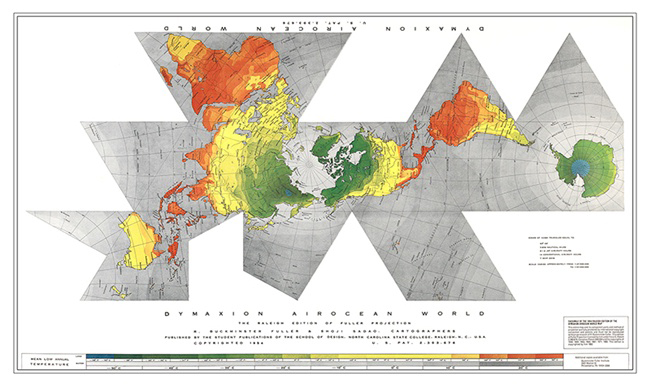 Source: Buckminster Fuller Institute http://bfi.easystorecreator.com/images/raleigh.jpg
© 1954, Buckminster Fuller and Shoji Sadao
Available from BFI.org and www.ODTmaps.com
|
Micro considerations (internal details) Turning now to the arrangement within each octant, in particular the graticule: 1) The Graticule Not being a mathematician, I can't speak to the fine points of how Waterman derived and laid out his graticule (nor how it would differ from his long-awaited second edition, said to be still more equal-area.). Instead, what I am doing here, as before, is to compare and contrast his graticular design, and mine. Elsewhere I have described in exhaustive detail how my design approached this fundamental question of a graticule for a world map: the total arrangement of meridians and parallels. To backtrack a bit: in 1975, no sooner had I seized upon Cahill as a master profile for a world map (reconfigured to an M-shape), then I noticed that disparities in height or width of adjoining geocells were all too visible when the map is blown up to large scales, e.g., 1/1,000,000. I determined therefore, in my Cahill re-design to assure that all adjacent geocells were proportionate to one another, and the map as a whole, despite their progressive shrinkage toward the middle of each octrant. I fullfilled that design fundamental, by (a) varying the angle of each meridian only in equal increments in each sector of the octant; (b) equisecting each meridian (with certain small exceptions detailed elsewhere, to avoid sags and cusps of the parallels when crossing octants); and (c) equisecting each parallel throughout. Despite a superficial similarity of our octants, closer inspection reveals basic differences, especially at the poles. That old adjacent-geocell-disparity problem occurs in Waterman as well as Cahill, to be discussed further in Part C below. A) Antarctic Polar segmentsAntarctica shows three divergences between Waterman and Cahill-Keyes:
|
|
||||
B) Arctic Polar incisionsElsewhere I have argued that one of Cahill's design mistakes was an excessive incision from the poles of 22.5°, which sliced into northern Russia, and the Canadian mainland, detracting from the uninterrupted-continent forte of his octahedral. Therefore, in my re-design, I reduced the polar incision to 17°, so as to avoid splitting the Yamal Peninsula in Russia, and the large Victoria Island in the Canadian Arctic. Waterman's map, too, reduced the incision, but his goes a little past 18°, which does split into Yamal and Victoria. These may seem like trivial details, but my standpoint is a world base map as large as 1/1,000,000 or bigger, where such gashes are far more enormous and ruinous. |
| Figs. 8-11: How a 17° vs. 18° polar incision affects Canada and Russia: |
Source: scans by GK of Waterman's wall map (1996), and Cahill-Keyes hand-drawn wall-map prototype (1980). |
C) Polar Meridians and Arctic DistortionsNotice, furthermore, the difference between the polar meridians in Waterman, and Cahill-Keyes. In Waterman, the longitude widths are progressively narrower from the center to the edge of each octant. Mine are uniform all the way. This narrowing and widening causes a distortion of Ellesmere island in Waterman — the "chess-knight" shaped one just northwest of Greenland — , whereby the "head" is stretched much too far eastward. Instead, it should look more like the orthographic view on the right, or the globe photograph below (or my Ellesmere, above right, Fig. 11). |
|
|
Fig. 14: Hand-drawn Cahill-Keyes 5º
graticule on a Replogle 10" globe. Here is where my precept of global fidelity
comes into play. The test of a map's fidelity is its comparison to
a globe, with point for point consonance: whether octants, continents, islands, or geocells.
|
 Source: digital photo by Gene Keyes. For explanation, click here and scroll to figs. 9.6.12 and 9.6.13; for more, click here. |
|
And likewise, Waterman's Greenland is somewhat stretched westward,
due to the extra spacing of the polar meridians toward the center from each
direction. This point is underscored by Waterman's failure to show all the
5º meridians in his Antarctica assembly, where the unevenness of his
longitudes would be more conspicuous. He also fails to show his 5º Arctic
polar assembly, which would further expose the uneven spreads of those meridians
around the pole. Below is an enlarged cut-and-paste I made, to illustrate
that point. Notice that at 75º of latitude, the central longitudes
of each octant are twice as wide as the outermost ones. This is the geocell-disparity
problem I mentioned above.
|
|
Fig. 15: A closer examination of Waterman's Arctic region:
|
 Source: scan by GK to 222% of a cut-and-paste from Waterman's wall map. |
D) Comparison of Waterman and Cahill-Keyes Graticules The variability of longitude widths occurs to a lesser extent in the rest of the map as well. They start out equal at the Equator, but in higher latitudes become fatter in the middle and thinner toward the edges. The Cahill-Keyes Octant Graticule, on the other hand, maintains approximately equal longitude widths for each degree of latitude in the entire map. This is accomplished by arranging for all meridian angles to change only at a constant rate within the three sectors of the octant: polar, middle, and equatorial. The three swathes of meridians bend at respective joints which are not tangent to a parallel, (nor fold line), but are determined by trigonometry. (For more details, diagrams, and tables of the Cahill-Keyes, click here. Latitude heights per degree vary somewhat from one sector to the next, but not disproportionately.) |
|
Figs. 16 and 17:
Below are images of the bare graticules of the Waterman and Cahill-Keyes maps.
At this small scale, it is hard to point out the internal differences; they
would be much more apparent at 1/10,000,000, and especially at 1/1,000,000.
But this is the only one I have of the Waterman graticule, and making it
any larger spoils it:
|
Fig. 16: Waterman gratricule:
Source: Carlos Furuti |
| Likewise, this tiny monitor-rendition of the Cahill-Keyes cannot do justice to its weave (although its pdf, if printed out at this size, actually shows the 1º graticule, and millimeter grid): |
|
Fig 17: Cahill-Keyes graticule

|
|
However,
if the above image's pdf is blown up to a scale 10 times larger, about 1/20,000,000,
the proportionality of the 1º and 5º geocells is far more visible
(despite the monitor's zaggies, unlike a printed version). I am including
my own graticule here, because, being accustomed to its lay of the meridians,
uniformly spaced from the poles onward, is what makes me aware of the uneven
spacing of Waterman's polar meridians. (As of now, I could declare that I
have a better graticule, and Waterman has better geophysical content!)
|
Fig. 18: Cahill-Keyes graticule, 10x larger
|
| Epilogue: Further notes on the development of the Waterman World Map
Better mousetraps don't always succeed, at least in the short run. The antiquated
Mercator and the horrible Homolosine are still everywhere. Cahill's
maps (and Fuller's) were both commercial flops, and so far Waterman's is in
their august company. (Shoji Sadao, Fuller's co-cartographer of the Dymaxion
Map, told me that when they published it in 1954, they expected the money
to come rolling in, but no such thing happened.)
Waterman wrote me that after he printed the map in 1996, he sold a very few copies from his home. In 2005, he signed an exclusive contract with ODT to promote and distribute the map (in wall map, post-card, and magnet versions). However, despite ODT's best efforts, sales were very slow, and an expected second edition, mathematically refined, could not be funded. In 2010, ODT yielded back the rights to Waterman, though ODT will still be selling its existing supply. In September 2010, Steve began offering on his website single-copy big-poster size versions of his map at several larger scales than the original. While their internal details are the same, he modified the color scheme to lighter hues, changed the ancillary materials, and provided a Pacific view option as well as Atlantic. (See his website.) As for myself, I am a short-term pessimist and long-term optimist about the prospects for a better map in Cahill's footsteps. I wish Waterman all the best for his; while I will be pursuing mine as a hobby, and open-source project. |
|
Fig. 20:
Another doctored Waterman map; on wall behind my desk: This is the 1996 version, cut-and-pasted by
GK into the Cahill-Keyes M-profile; again, filling the tooth-sockets with
the missing teeth of Antarctica.
(Note: Steve feels that my reconfigured images are not representative of
Waterman maps, based on the grounds that selected portions of the globe are
shown in duplicate.)
|
 Source: 1996 Waterman map, re-arranged by GK; insets are (L) Pacific Butterfly, from wall map itself; (R) Atlantic Butterfly (postcard version); (top), Arctic assembly, cut-and-paste by GK. Digital photo by GK. |
|
Fig. 20, 21, 22 (clockwise from bottom):
As before, I am including my own maps, to wrap up this compare-contrast review.
Below, (lower left), same map as Fig. 20 above, flanked by two Cahill-Keyes versions. These
are all squeezed onto the wall behind my desk. Upper map is 1/20,000,000, and 2 meters long. Waterman
map on lower left is 1/43,000,000. C-K map on lower right is 1/50,000,000,
adjacent to a 10-inch globe with the same scale and 5º graticule. This
synoptic pairing of same-scale and same-graticule globes and maps is what
I have been aiming at for a long time.
|
For full-size (2.3 x) image, click in it once. To restore small size, click in it twice.
|
|
So
in sum, Steve Waterman has produced a splendid 5º octahedral map; professionally
done in a size and color that would make Cahill proud, despite its variation
in origin and detail from his. But I certainly wish that the polar areas
were designed differently, both as to internal graticule, and external placement
of Antarctica, without chopping off the southern chunks.
|